How to Wear Pantone’s Colour of the Year 2020: Classic Blue

The secret’s out – the Pantone colour of the year is… *drumroll please* Classic Blue!

Described as a timeless and enduring blue hue, Classic Blue offers elegance & simplicity.

Suggestive of the evening sky, it’s a reassuring shade that is said to highlight our desire for a dependable and stable foundation on which to build as we cross the threshold into a new era – whether that’s from one decade to another or from pregancy into motherhood!


View this post on Instagram


A post shared by Seraphine Maternity (@seraphinematernity) on

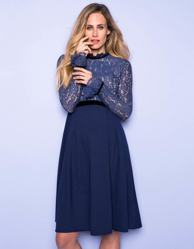
Get the Look: Marlene Maternity Cocktail Dress

Leatrice Eiseman, Pantone Color Institute’s Executive Director explains what inspired this year’s choice:

“We are living in a time that requires trust and faith. It is this kind of constancy and confidence that is expressed by Classic Blue, a solid and dependable blue hue we can always rely on. Imbued with a deep resonance, Classic Blue provides an anchoring foundation.”

Find out more at Pantone.com

How to Wear Classic Blue

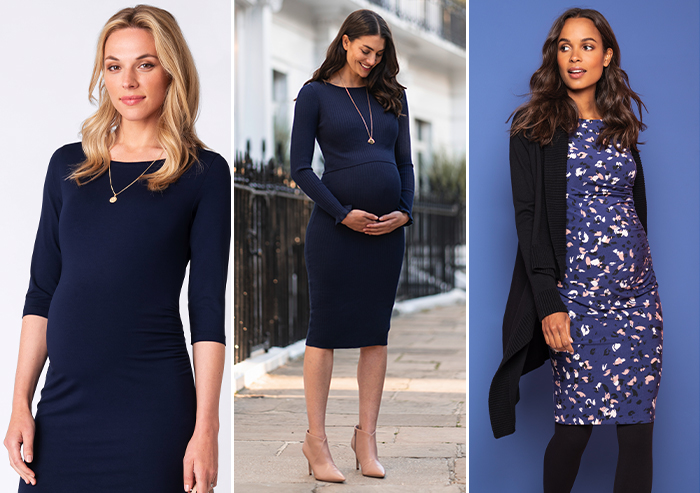
classic blue maternity dresses

L to R: Maternity Shift DressRibbed Maternity & Nursing Midi Dress, Modal Bodycon Maternity Dress

Our favourite thing about Pantone’s choice this year is that it’s SO easy to wear!

It’s such a dependable shade, you can wear it anywhere. Whether at work, at home, or even for special occasions, a classic blue dress will never be out of place and we have plenty of gorgeous options for your maternity wardrobe.

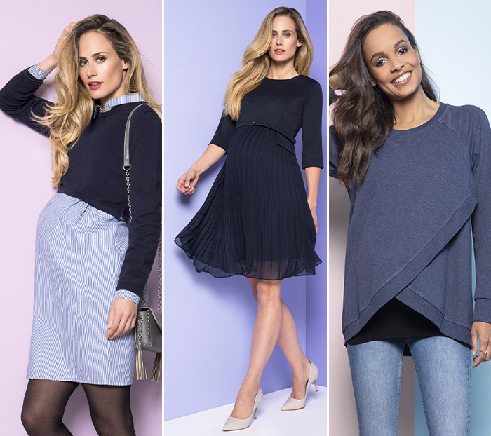
Classic Blue Style

L to R: 2 in 1 Cotton Maternity & Nursing Dress, Pleated Maternity Dress, Crossover Maternity & Nursing Sweater

It’s also the perfect shade for an accent accessory to complete your outfit. Add a blue bag, scarf or even a statement pair of boots for a truly eye-catching addition.

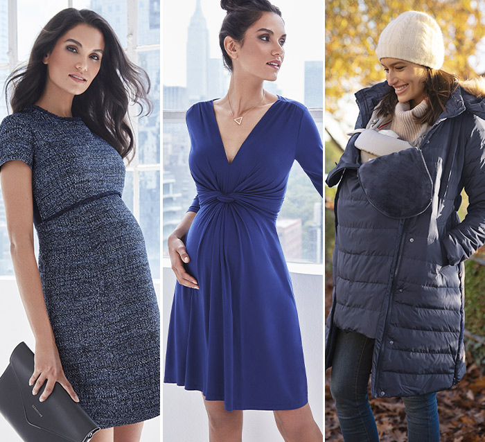
Classic Blue maternity fashion

L to R: Bouclé Maternity Shift Dress, Knot Front Maternity Dress, 3 in 1 Down Maternity Coat

During pregnancy your body is changing so quickly, that turning to such a dependable shade can be a wonderful way of feeling more comfortable & confident in your new curves.

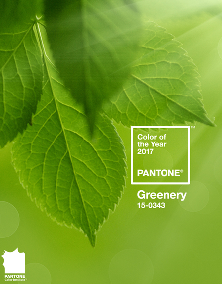
Pantone Colour of the Year 2017: Greenery

The word is out mamas: The Pantone colour of the year for 2017 is Greenery! Get set for a green explosion in design, lifestyle, fashion and beauty.


Watch the Video & Meet Greenery

A fresh and zesty shade of green, the colour experts at Pantone are calling Greenery “nature’s neutral”, encouraging us to “take a deep breath, oxygenate and reinvigorate”. Designed to take us back to nature, it provides the perfect counterpoint to modern urban life.


A photo posted by PANTONE (@pantone) on


Leatrice Eiseman, the Executive Director of the Pantone Color Institute explains what inspired this year’s choice:

“Greenery bursts forth in 2017 to provide us with the reassurance we yearn for amid a tumultuous social and political environment. Satisfying our growing desire to rejuvenate and revitalize, Greenery symbolizes the reconnection we seek with nature, one another, and a larger purpose.” – Leatrice Eiseman, Executive Director of the Pantone Color Institute.


Greenery Baby Shower Theme

Pantone Greenery themed baby showers & decor

This gorgeous shade makes the perfect baby shower colour scheme. Team it with blue and turquoise for a boy or with pretty pink for a girl. Or pair it with pristine white to keep it gender neutral – check out some of our best maternity dresses to match with your scheme. Fresh flowers add the perfect pop of colour for a greenery themed shower – you could even colour coordinate your catering with cute cucumber sandwiches!


Greenery in Nursery Décor

Here at Seraphine, we love the idea of incorporating Greenery into baby’s nursery décor or even older kids’ bedrooms. It’s fresh and bright, yet somehow soothing and is a fantastic unisex shade for little ones. Try introducing Greenery as an accent colour to jazz up a more neutral palate of whites, creams or greys. You could bring in a few statement green accessories, like a cool rug, lamp shades or chair. Or if you’re feeling brave, why not take the plunge and opt for a feature wall!


For more colourful inspiration, check out our Pantone Colour of the Year Board on Pinterest!

Rose Quartz & Serenity | Meet the Pantone Colours of the Year 2016

The fashion powers that be have spoken: The Pantone colour of the year 2016 has been announced and for the first time ever there’s two of them! This year Rose Quartz and Serenity are set to team up and take centre stage.

Used as stunning standalone shades or combined as a killer pastel pairing, these colours are designed to promote “mindfulness and well-being as an antidote to modern day stresses.”

Set to define design trends for the year to come, from stylish scatter cushions to lipsticks, winter coats and adorable baby clothes; here are a few of our favourite ways to work the shades of the year…


Rose Quartz & Serenity for Mummy

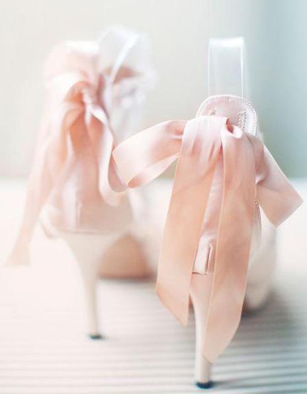
When it comes to styling the Pantone colours of the year for pregnancy, we have plenty of fashionable options to choose from. Dressing for this trend is all about layering up separate pieces in block colours of each shade. Try pairing our Blush Lace Maternity Cocktail Dress with our Powder Blue Natasha Cashmere Blend Coat. Or why not style our Chevron Print Maternity Dress with pink shoes, accessories and lipstick for a fresh spring look. You could even work the trend at bedtime by slipping on our Blue Polka Dot Nursing Nightie with your favourite fluffy pink slippers and dressing gown!


Rose Quartz & Serenity for Baby


Of course it’s not just you who’d look gorgeous in these pretty pastel shades…. Check out the Diana Award Collection – a beautiful new range of designer baby clothes available exclusively at Seraphine, in glorious pinks and blues and featuring the stunning Diana Pastel Tartan. Fall in love with pretty tartan baby dresses, soft cashmere cardigans and smart coats. And melt over adorable fleece-lined baby booties and charming tartan bonnets.


Rose Quartz & Serenity at Home

When combined in just the right way, Rose Quartz and Serenity harmonise in a room to create a space that’s calming and nostalgic with a surprisingly sleek and modern finish. They make a stunning choice for the nursery, and work wonderfully together in kitchens and bathrooms. When incorporating these shades into your home, Interior Designer Jared Sherman Epps suggests: Let one colour take the lead and allow the other to act as an accent to create a serene but striking balance.”


Rose Quartz & Serenity in Beauty

This daring colour duo is sure to be a big hit in the beauty world. Sephora have already released their Pantone Universe inspired range complete with lipsticks in both creamy rose quartz and unexpected serenity. Both shades make for beautiful nail polishes, rose quartz is the perfect blush for a fair complexion, and we predict that this trend could even herald the return of retro blue eyeshadow.


For more colourful inspiration check out our Pantone Pinterest Board:
Follow Seraphine Maternity’s board ROSE QUARTZ & SERENITY – 2016 PANTONE COLORS OF THE YEAR on Pinterest.


Translate »